Our Brand guidelines

The Magify logo consists of two elements, the icon and the logotype.

Mostly used on colorised backgrounds or in cases when Main logo could not be printed.


As a product line and brand extension of Magify, it is important to follow naming conventions and guidelines to maintain consistency and cohesiveness across all facets of the brand. Outside of paragraph text, written as “Magify”, the following variations depict allowed/disallowed alternatives in our graphic designs and brand visuals.

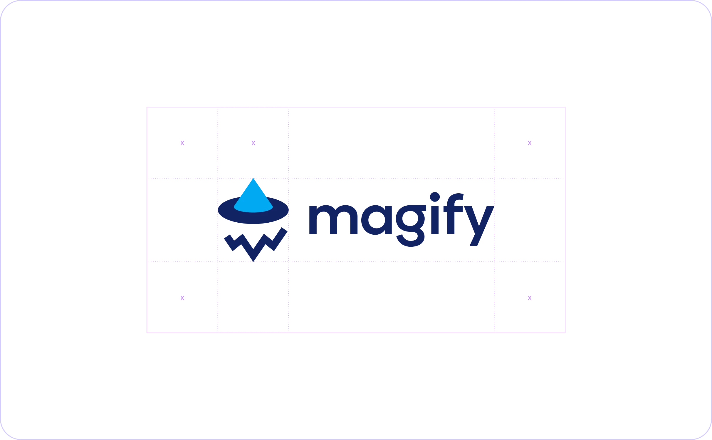
Do not change the size relation between icon and logotype. There must always be sufficient space surrounding the Magify logo to avoid competition with other visual elements and to maintain its visual impact. The recommended clear space is relative to the Logo size and is equal to Height of the Hat (X). Allow at least this amount of clear space to give the logo clarity.
